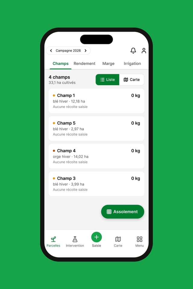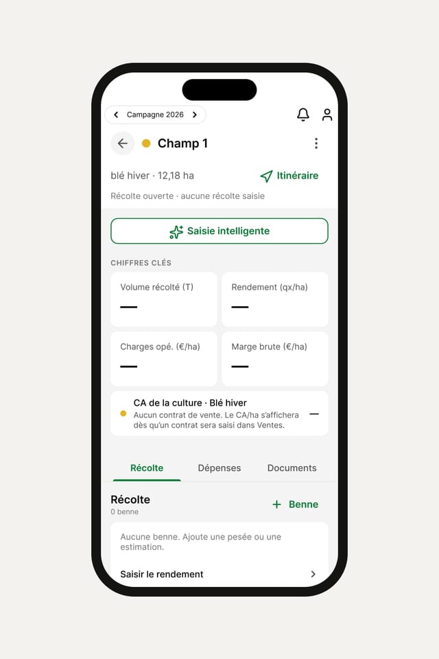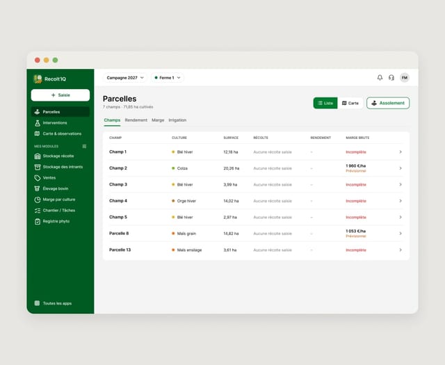
Recolt’IQ is a platform for farmers, usable on mobile and in a web browser. It has to serve two very different situations: use out in the field and management from a computer at the office.
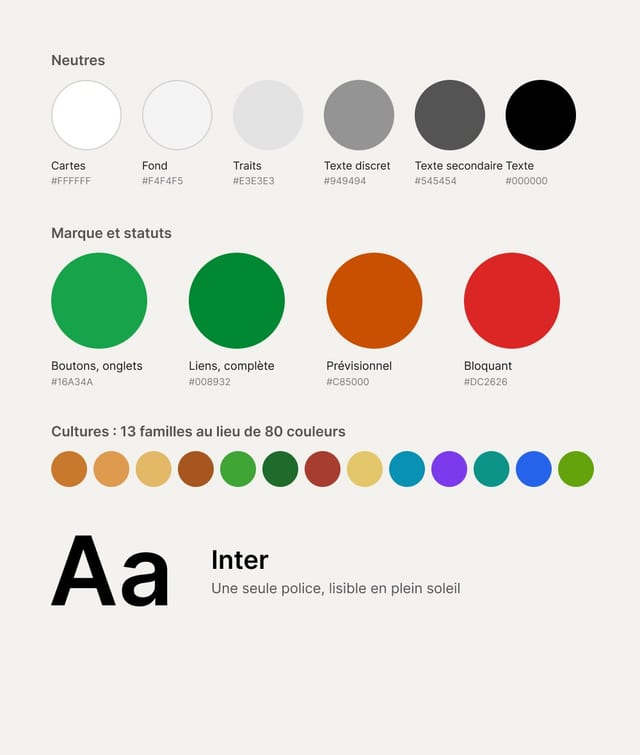
The platform had many screens and features, with a dense existing interface and a palette of more than 80 colours. The challenge was to simplify the experience without removing the information users need.
Research & process
I started by going through the screens and features to understand how the app worked. As I didn’t know the farming world, I talked a lot with Thibaud (founder and developer) and Adrien (co-founder) to understand the terms used and how important each piece of information was.
I had to tell apart what was necessary for the app to work and what could be simplified in the interface.
The project required me to find a balance between my designer’s eye and the habits of the trade. Adrien knows what a farmer needs, but he doesn’t represent every Recolt’IQ user on his own. I had to take his feedback into account while keeping a broader view of the experience.
Field use shaped my choices. The app has to be usable quickly, sometimes in full sunlight, with a phone in hand. Important information had to stay readable and the main actions easy to reach.
UX & interface system
The first piece of work was on colours. Each crop had its own colour, which added up to more than 80 colours in the app. That was hard to remember and also caused an accessibility problem.
I grouped the crops into 13 categories to build a simpler colour system. The aim was to keep colour-coding without having a different colour for every crop.
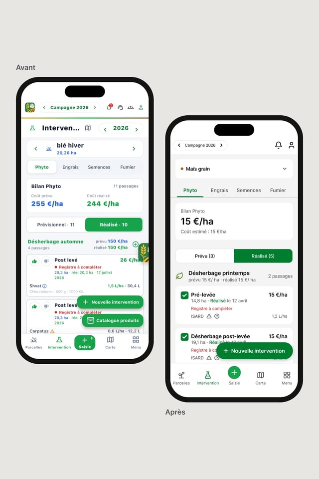
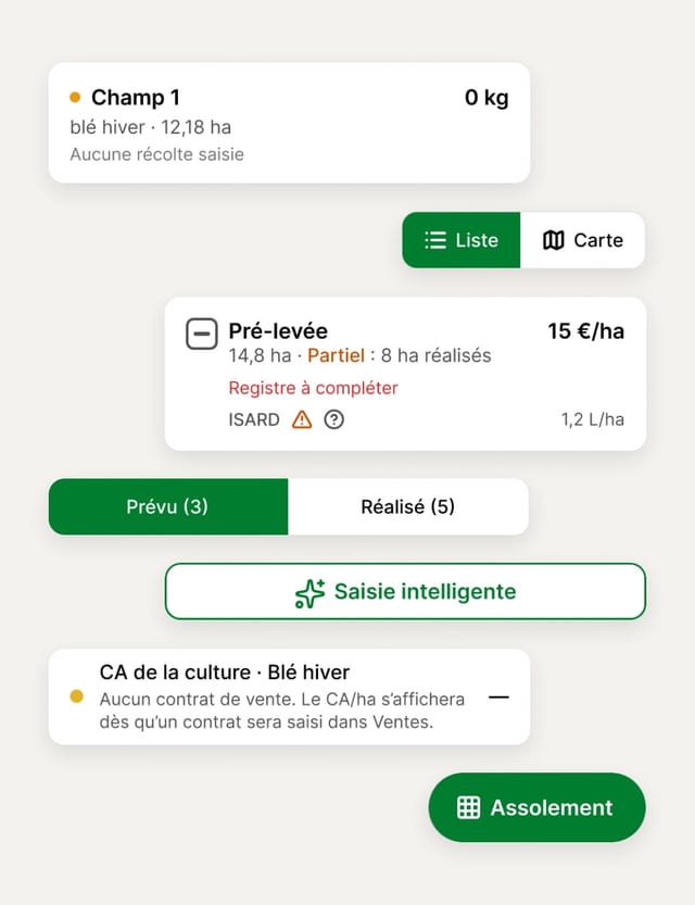
I reworked the buttons, switches, icons and navigation. Many icons were used to convey information that could be shown more simply. The navigation bar and the top bar held too much information, so they were simplified too.
The floating buttons took several discussions. At first, I wanted to remove them. In fact, they match the main action of each screen: creating an intervention, exporting a register, opening a trailer load or carrying out another frequent action.
In the field, these buttons let you get straight to the action without searching the page or scrolling. I kept this system and adapted it to the different screens.
The spraying register was one of the screens that took me the most thought. The first version showed several red boxes and the information to correct directly in the page. The alerts took up so much space that you could no longer see the register itself without scrolling.
I grouped this information into a notification at the top of the screen, with a “Fix” action. The register’s status is visible as soon as you land on the page, without taking up all the space.
Showcase website
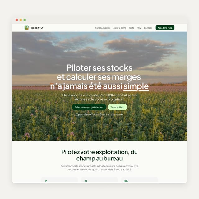
I reworked the Recolt’IQ showcase website to present the tool and win over new users.
The first version had also been generated with Claude, but it didn’t follow the structure of a landing page and didn’t reassure enough a farmer who isn’t familiar with digital tools.
I reworked the section structure, the copy and the conversion arguments. The tone moved from informal to formal French, and the vocabulary was simplified.
I benchmarked farming platforms such as Agrivi, Farmbrite and John Deere to see how they present their tools and speak to farmers.
Result
The new interface is now used in Canada, by Adrien in his daily work, and in France, by around ten farmers. The app is still at launch stage, but it is now clearer, more consistent and more polished, with a foundation that can support its development beyond the French market.
The project also let me work on a product that isn’t only aimed at users used to digital tools, with the chance to design from the start an app that can grow towards an international audience.