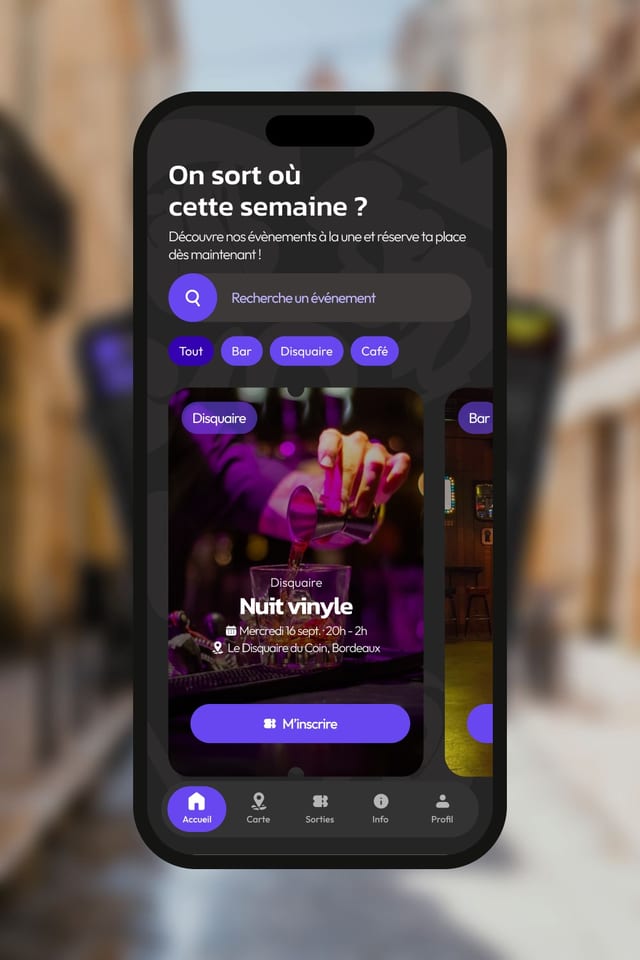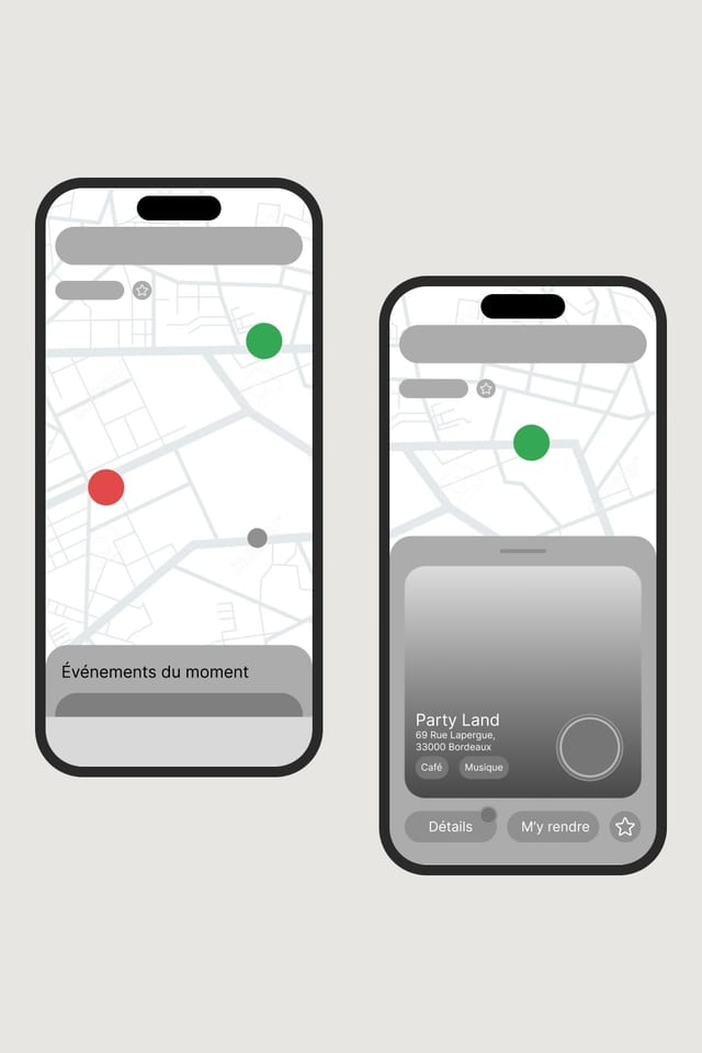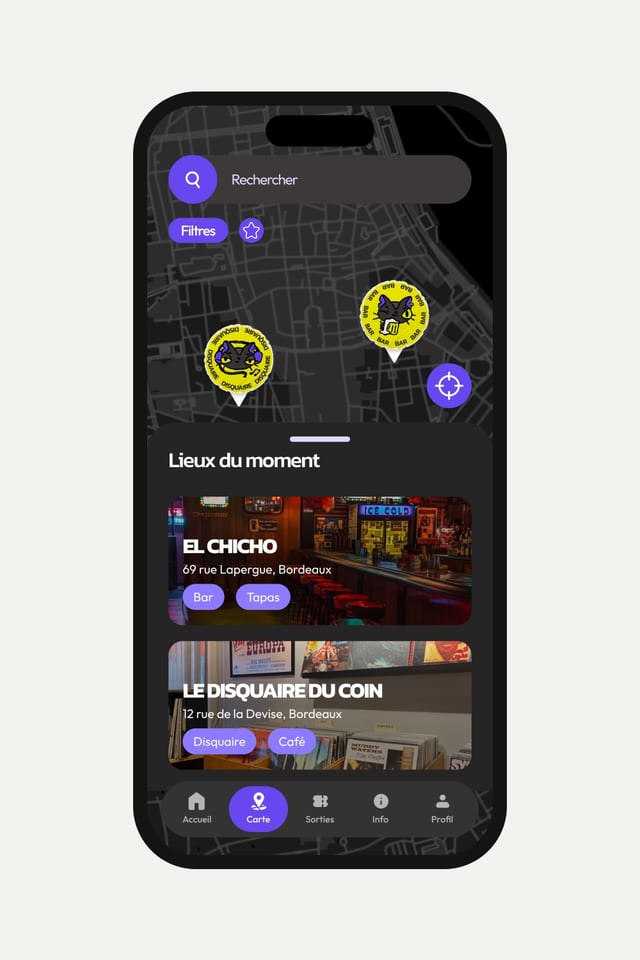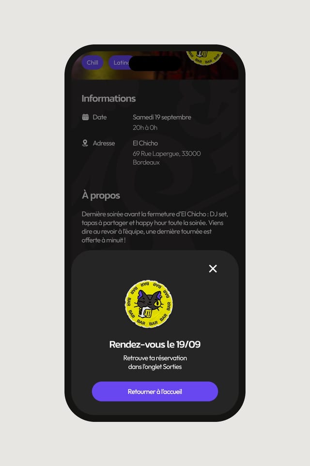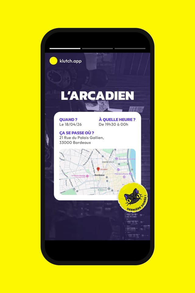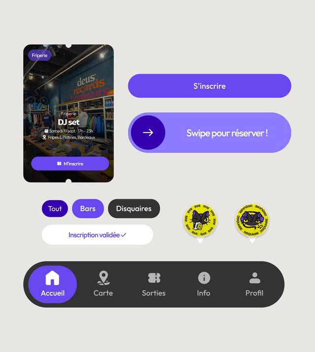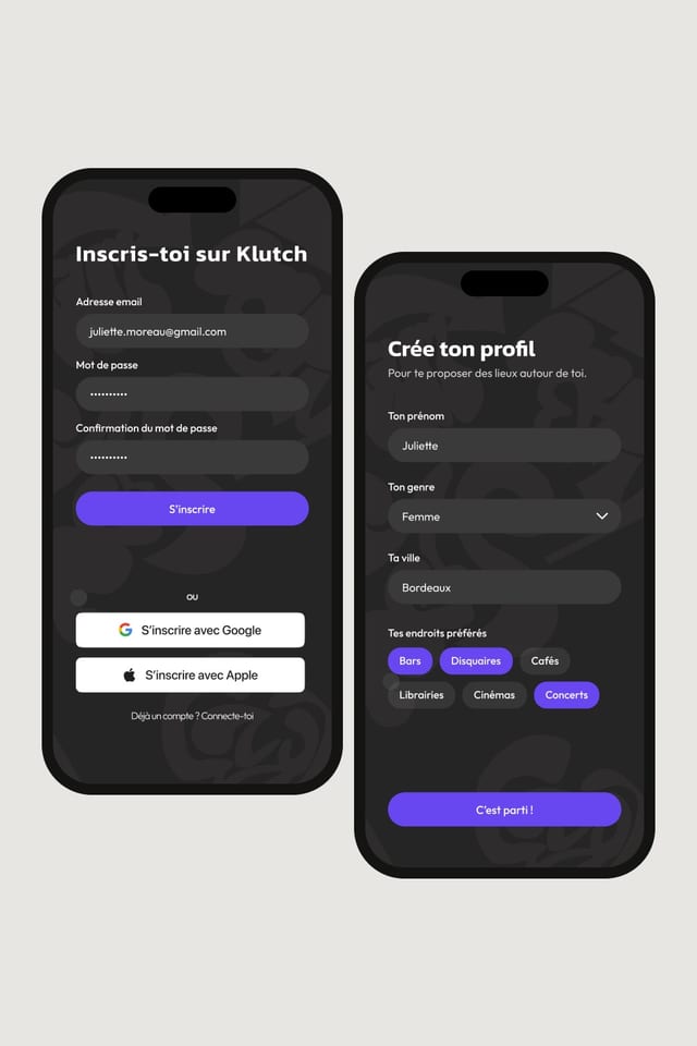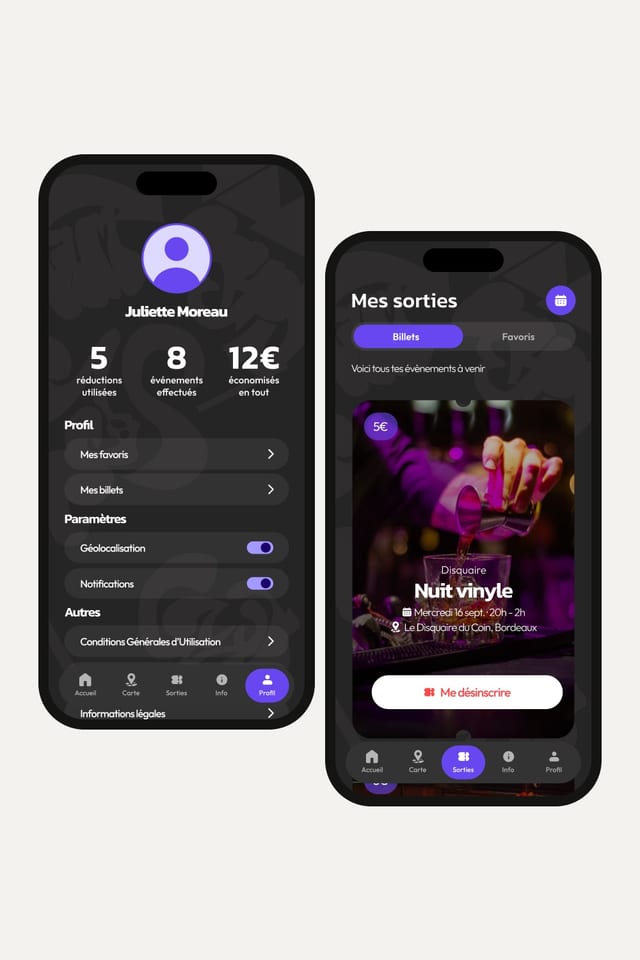
The challenge was to design an intuitive interface that makes it easy to find places, while raising users’ awareness of the situation of struggling businesses, especially among students.
Research
A business goes through several stages when it runs into difficulties.
- Safeguard: the company reorganises
- Receivership: it must quickly win back customers
- Liquidation: closure becomes inevitable
An influx of customers can influence the court’s decision during the judicial observation period. This is where Klutch users come in: going there as a customer is a concrete act of support.
Art direction
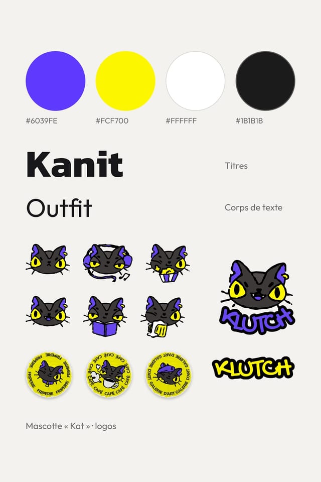
“Klutch” is a variation of the English word clutch, which refers to a decisive action or moment. The name evokes the idea of seizing an opportunity at the right time: discovering a place before it disappears and taking action to support it.
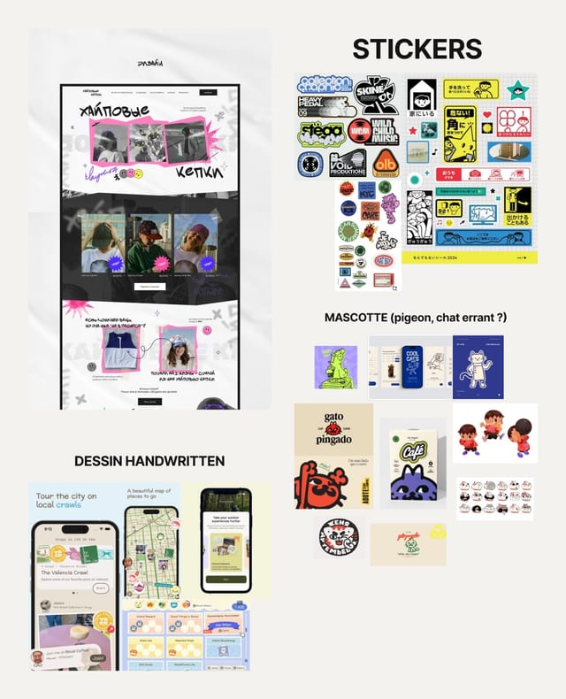
Klutch’s visual identity is built on a dark, high-contrast universe inspired by an “underground” aesthetic, to stand out from conventional apps and catch the attention of a young audience.
The mascot “Kat”, a nod to the “K” in Klutch, embodies exploration: she roams the city and guides users towards new discoveries.
Result
To guarantee the quality of the places listed, Klutch works with the specialist association SOS Entrepreneur and becomes part of its support process. Klutch doesn’t present itself as a saviour but as a link, offering:
- temporary events and offers for users,
- local, community-based visibility for businesses,
- connections between a network of associations and entrepreneurs.