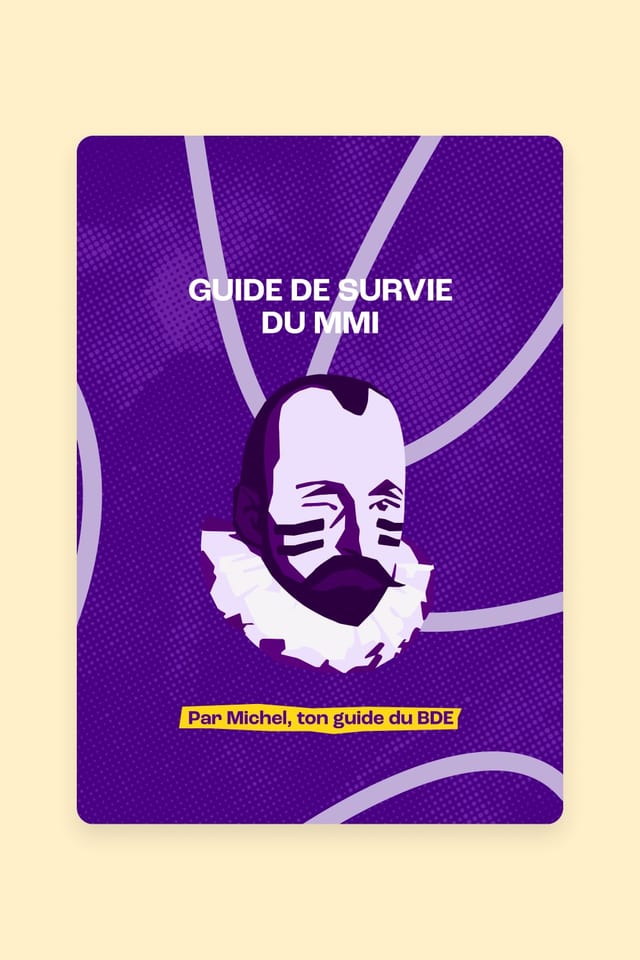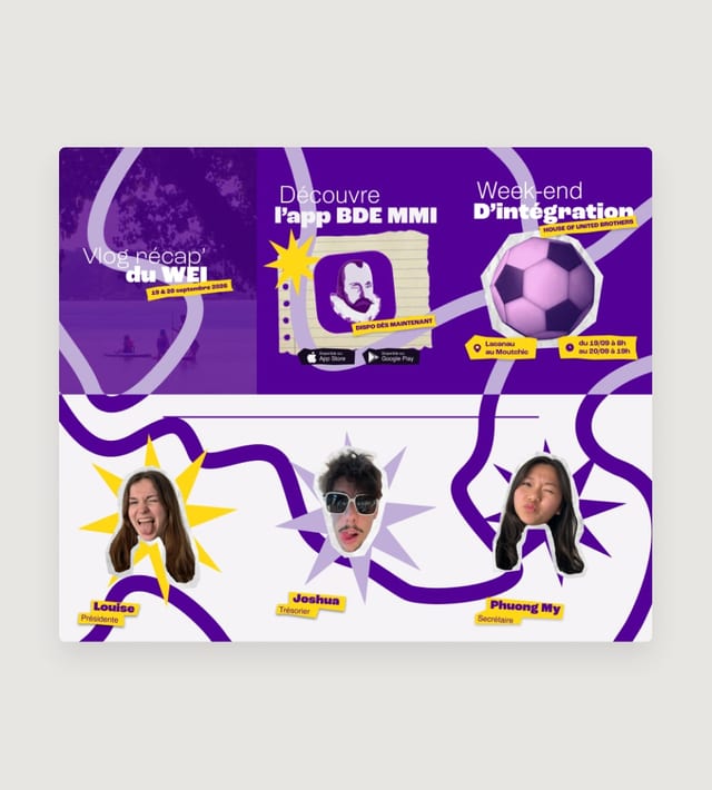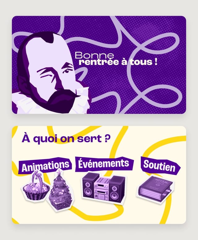
The BDE HUB already had a strong identity, built up by successive boards: 12 visual identities have followed one another since the association was founded. The challenge was to create a new art direction for the 2026-2027 term that could represent us, give the Student Union a more professional image with its partners, and work across very different media and events.
Research
Before creating a new identity, we started by looking at what already existed.
Each board had developed its own graphic universe. So we traced back the logos, colours and materials used over the years to identify the elements that had built the Student Union’s visual memory.
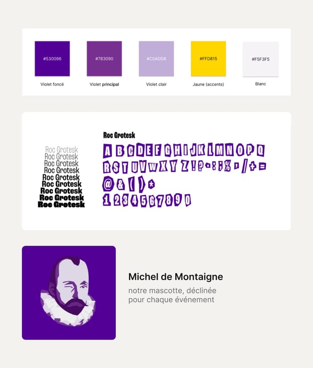
Two landmarks stood out: Michel de Montaigne, present since the association’s early days, and purple, which had become a recurring colour in the latest identities.
The goal was therefore not to start from scratch, but to evolve these codes into an identity that feels more current and better represents MMI students.
Art direction
We chose to build a bold, colourful identity inspired by digital culture, reflecting the students it speaks to.
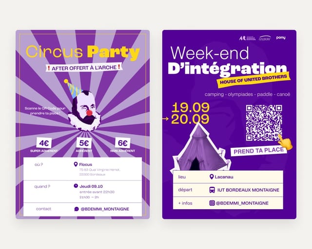
The different MMI tracks became a source of graphic references. For digital creation, elements are layered like a collage, with stickers, textures and more spontaneous compositions.
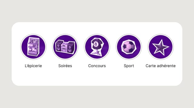
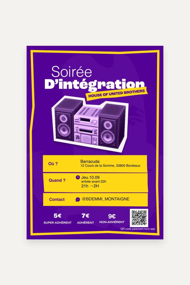
Programming draws on video game culture, with references to Mario, Animal Crossing and the pixelated graphics of PS1 consoles.
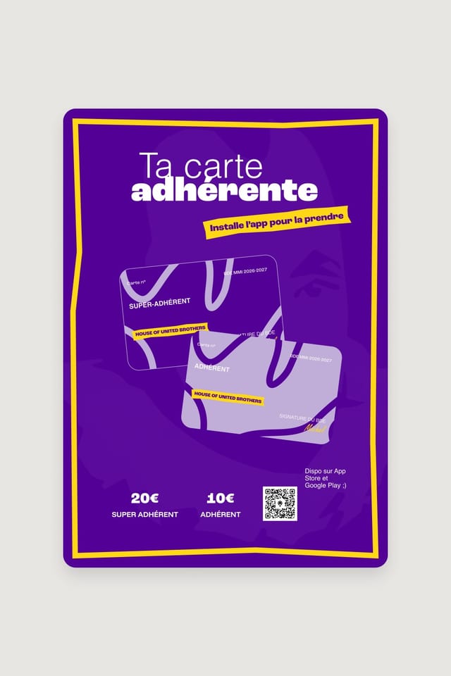
Abstract lines, already present in previous identities, are kept but made bolder. They create a link with the Student Union’s graphic history while giving the new universe more character.
Result
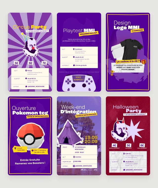
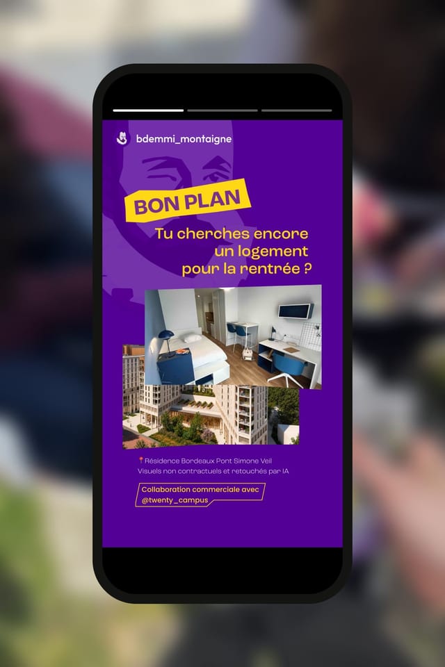
The identity was designed as a modular graphic system that adapts to all the Student Union’s media: social media, posters, events, partnerships and merchandise. Michel de Montaigne and purple remain the association’s main landmarks, while references to MMI culture let compositions evolve from one project to the next.
This new identity supports the 2026-2027 term and should help the Student Union gain consistency and professionalism while keeping its student character.
Since its launch, it has supported 3 partnerships with international brands, 1 paid partnership with a national brand and 5 events planned for September 2026, including the second edition of WESE, which is expected to bring together more than 150 students.